May. 25th, 2023 Update🎉: This interactive visualization won the Bright Futures Award (2nd Place) of the 2023 NNLM Data Visualization Contest under the Complex Visualization category. Here is the official award announcement, and here is our work summarized on Zenodo.
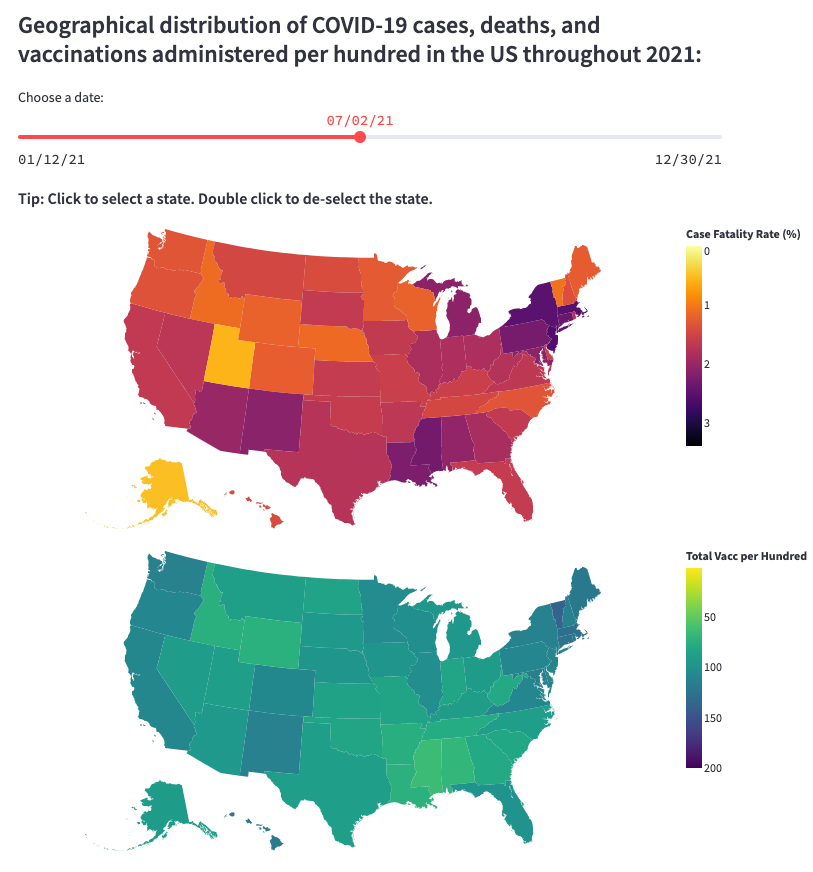
This interactive visualization uses a Python-based app framework called Streamlit to demonstrate COVID-19 cases, deaths, and vaccinations data in US by states. This visualization also allows you to check out the geographical distribution and the temporal evolution of the case fatality rates and the total vaccinations per hundred people for various states at different time points. The data for this visualization were obtained from the New York Times and Our World in Data.
Click on the visualizaiton below to play with it!
You can also click here to access this interactive visualization.
